Unleash Your App-Building Potential: Master the Art of Creating Stunning Apps with React Native!

Are you ready to bring your app-building ideas to life? Look no further than React Native, the popular JavaScript framework that allows developers to create dynamic and powerful apps for both iOS and Android platforms. With its intuitive interface and extensive library of pre-built components, React Native is a top choice for app development. In this guide, we'll show you how to master the art of creating stunning apps with React Native, providing you with the tools and knowledge you need to take your skills to the next level. Let's dive in and unleash your app-building potential!. Follow these essential steps:
1. Set up the development environment:
Download and install the next tools in your computer
Watchman (if you are using Linux or Mac).
Download and install Expo Go in your mobile
2. Create your project.
Let's embark on an exciting journey to create our very own trivia app! Get ready for a hands-on experience as we dive into the process. To kickstart your project, simply open up the terminal and unleash your creativity by entering the following command:
npx create-expo-app yourappnameIf everything went smoothly, you'll be greeted with the following delightful messages in your terminal.
✔ Downloaded and extracted project files.
✔ Installed JavaScript dependencies.

✅ Your project is ready!

To run your project, navigate to the directory and run one of the following npm commands.

- cd yourappname
- npm run android
- npm run ios
- npm run web
Now, let's step into your project and prepare to witness the enchantment unfold. Get ready to experience the magic!
cd yourappname
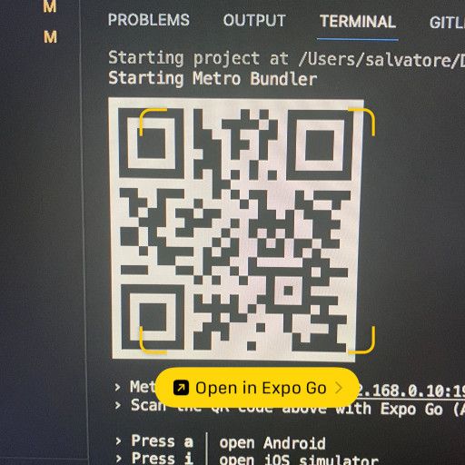
npm startAnd you will see this message
Starting Metro Bundler
▄▄▄▄▄▄▄▄▄▄▄▄▄▄▄▄▄▄▄▄▄▄▄▄▄▄▄
█ ▄▄▄▄▄ █ ██▀▀ ▀▄▀█ ▄▄▄▄▄ █
█ █   █ █  ▀█ ▀█ ▄█ █   █ █
█ █▄▄▄█ █▀  █▄█▀▄██ █▄▄▄█ █
█▄▄▄▄▄▄▄█▄█ ▀▄█▄█▄█▄▄▄▄▄▄▄█
█▄ ▀█ ▄▄█▀█▄█▄▀▄ ███ ▀▄▄ ▄█
██▄▀  █▄ ▀ ▄█▀█▀  ▀ █▄  ▀██
█  █ ▀█▄▄██▀▄▀█▄▀▄▀▄▀▀▄ ▀██
███▄█  ▄▄█ ▀ ▄█▀▄▄▄█▄▀ ▀███
█▄▄▄███▄▄▀▄▀█▄▀▄▄ ▄▄▄ ▀ ▄▄█
█ ▄▄▄▄▄ █▀█▀█▀██▀ █▄█ ▀▀▀██
█ █   █ █▄▄ ▄ ▀▄█▄▄ ▄▄▀ ▀▀█
█ █▄▄▄█ █▀ ▄ ███▄██▄▀█▀▀ ██
█▄▄▄▄▄▄▄█▄▄████▄████▄▄▄▄▄▄█

› Metro waiting on exp://192.168.0.10:19000
› Scan the QR code above with Expo Go (Android) or the Camera app (iOS)

› Press a │ open Android
› Press i │ open iOS simulator
› Press w │ open web

› Press j │ open debugger
› Press r │ reload app
› Press m │ toggle menu

› Press ? │ show all commands
Now, grab your phone and open the camera and scan the QR code. Remember, for this step, make sure you have Expo GO installed.
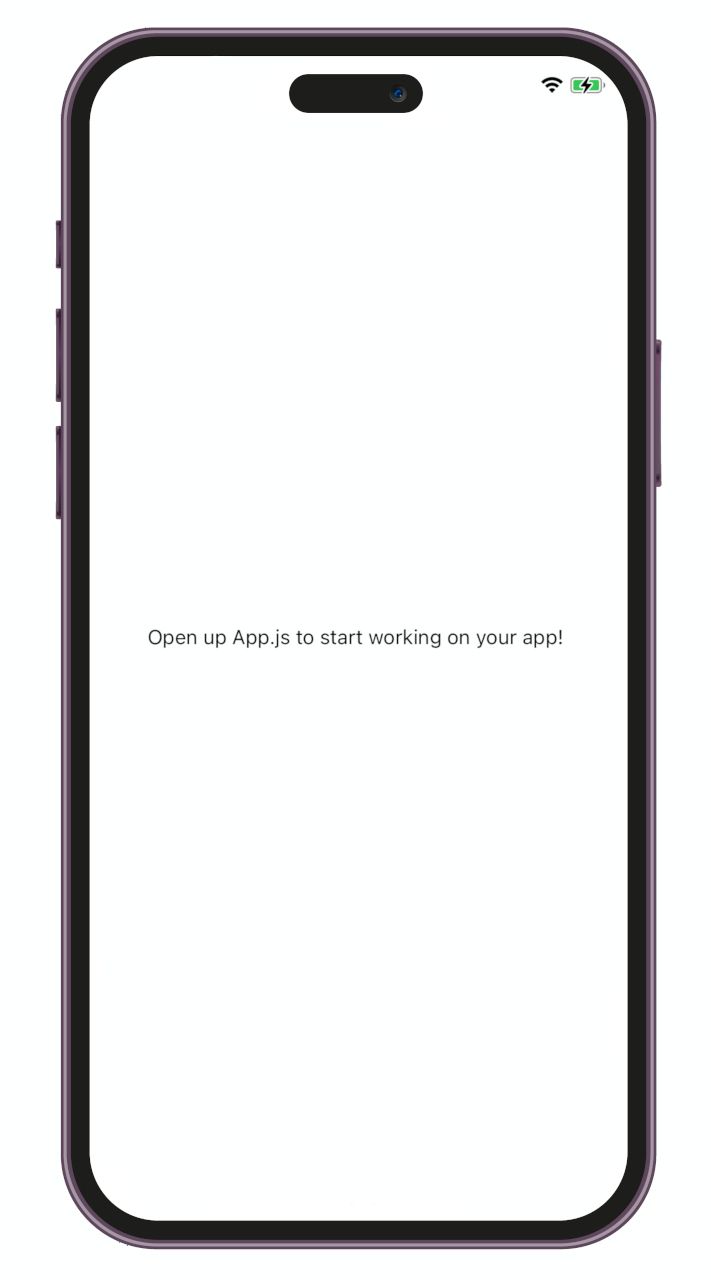
Your app will start to load and when is ready you will see the next screen in your phone
Now that all is ready let's dive in and begin crafting our remarkable trivia experience!
Trivia App
Lets understand what is this app about, a trivia app is a digital application that allows users to participate in interactive quizzes or trivia games. It typically presents a series of questions with multiple-choice, providing users with a fun and engaging way to test their knowledge on various topics.
The questions
In order to proceed, we require a series of questions accompanied by multiple options and their corresponding answers. We are going to use the questions below:
1. What is the capital of France?
a) London b) Paris c) Rome
Answer: b) Paris
2. Who painted the Mona Lisa?
a) Vincent van Gogh b) Pablo Picasso c) Leonardo da Vinci
Answer: c) Leonardo da Vinci
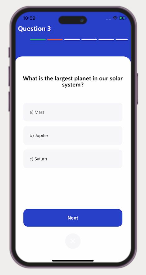
3. What is the largest planet in our solar system?
a) Mars b) Jupiter c) Saturn
Answer: b) Jupiter
4. What is the tallest mountain in the world?
a) Mount Kilimanjaro b) Mount Everest c) Mount Fuji
Answer: b) Mount Everest
5. Which country is known for inventing pizza?
a) Italy b) Spain c) Greece
Answer: a) Italy
6. Who wrote the famous play Romeo and Juliet?
a) William Shakespeare b) Jane Austen c) Charles Dickens
Answer: a) William Shakespeare
7. What is the national animal of Australia?
a) Kangaroo b) Koala c) Emu
Answer: a) Kangaroo
8. Which planet is known as the "Red Planet"?
a) Mercury b) Venus c) Mars
Answer: c) Mars
9. Who is the author of the Harry Potter book series?
a) J.R.R. Tolkien b) J.K. Rowling c) George R.R. Martin
Answer: b) J.K. Rowling
10. What is the largest ocean on Earth?
a) Atlantic Ocean b) Indian Ocean c) Pacific Ocean
Answer: c) Pacific OceanThe design
Now, our next objective is to design a visually stunning user interface (UI) that not only pleases the eye but also keeps things refreshingly simple. We aim to strike a balance between elegance and usability, creating an interface that effortlessly guides our users through the trivia experience. By embracing simplicity in our design, we can ensure a seamless and enjoyable journey for all trivia enthusiasts. Let's embark on this design process and create a UI that combines beauty, functionality, and simplicity in perfect harmony.
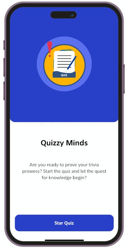
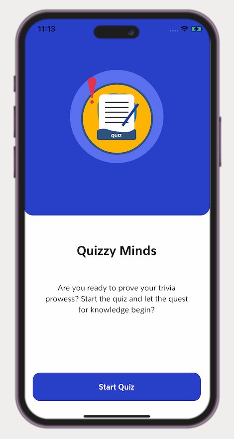
The home view
As the user launches the app, the home view is inviting them to embark on an exciting trivia adventure. With a simple layout, the home view entices users to delve into the world of trivia by presenting a clear and prominent "Start Quiz" button.
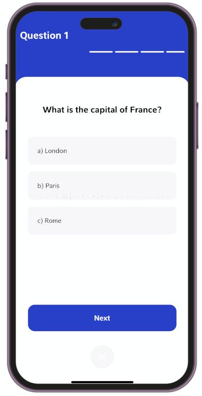
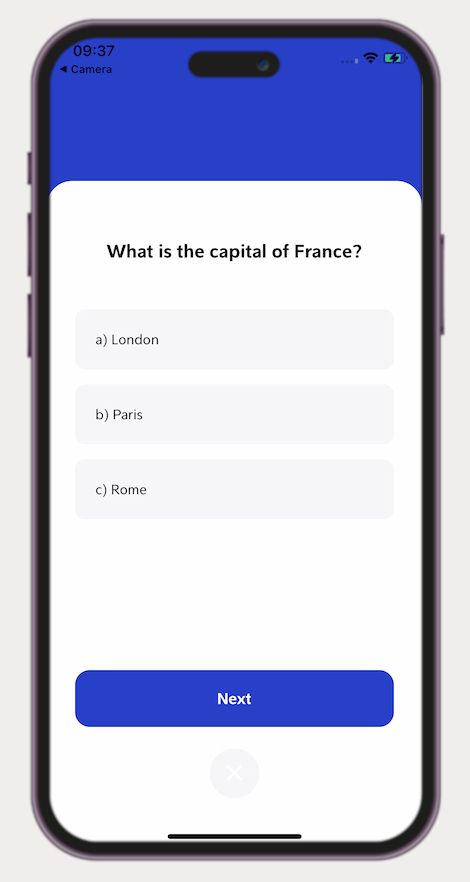
The question view
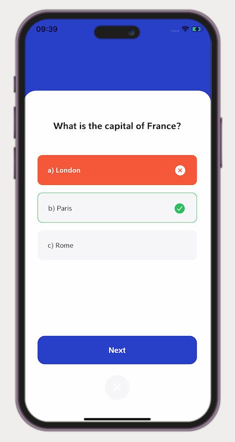
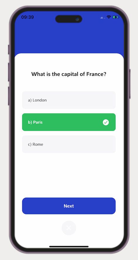
The question view is where the excitement intensifies as users immerse themselves in the heart of the trivia challenge. This dynamic view showcases a captivating question, accompanied by a set of multiple-choice options. The design ensures clarity and ease of interaction, with each option presented in a clear and legible format. Engaging visuals and animations enhance the user experience, making the question view visually appealing and captivating. Users can select their chosen answer with a simple tap, providing a seamless and intuitive way to participate in the trivia. The question view keeps users captivated, eager to put their knowledge to the test and discover if they have chosen the correct answer.
Wrong answer
Good answer
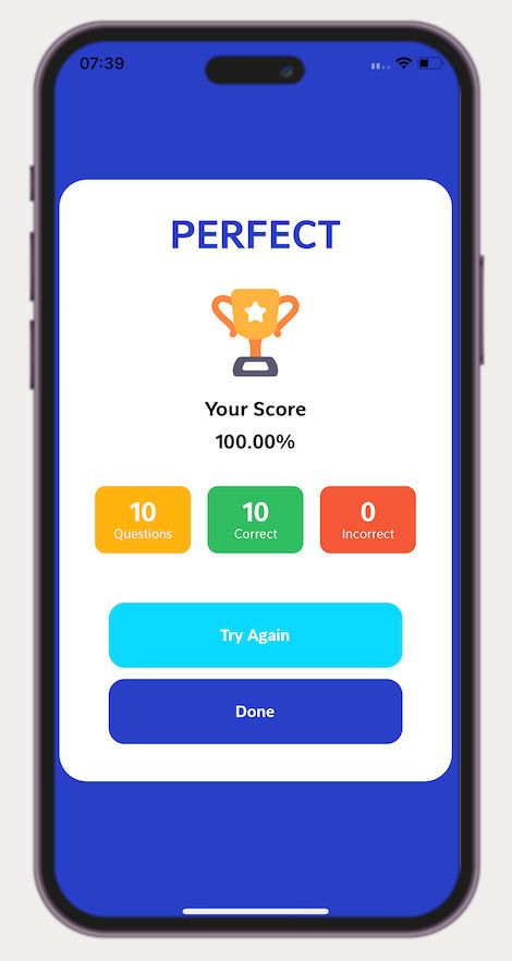
The final view
The final view is the culmination of the trivia experience, providing users with a comprehensive summary of their performance and revealing their final score. This view offers a visually pleasing and informative display that showcases the user's accomplishments throughout the trivia session. It presents a concise breakdown of correct and incorrect answers, allowing users to reflect on their knowledge and progress. The final score is prominently displayed, celebrating their achievements and providing a sense of accomplishment. With its sleek design and attention to detail, the final view serves as a gratifying conclusion to the trivia journey, leaving users with a sense of fulfilment.
The code
Is time to go through the creation of these stunning views. Grab your trusty VS Code and let's begin the journey to bring these views to life! Together, we'll unravel the secrets of React Native as we embark on this exciting coding adventure. Prepare to be amazed as we unlock the power of React Native and witness the magic unfold right before your eyes. Let's open up VS Code and unleash our creativity to create these captivating views!
The home view
First create a folder named views and inside create a file named HomeView.js its content should be something like this:
/* Text, View, TouchableOpacity are the components we are going to use to create our view*/
import { Text, View, TouchableOpacity } from 'react-native';

export default function HomeView() {

	return (
		<View>
		</View>
	);
}
Now open your App.js and do the next modifications:
/* add this import */
import HomeView from './views/HomeView';

export default function App() {
And inside the View
<View>
	<HomeView></HomeView>
<View>
Now go back to your HomeView.js and start to improve it.
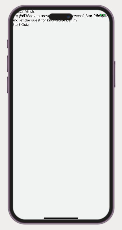
Our home view seamlessly combines key elements to create an inviting entry point. A captivating header proudly displays the name of our app, accompanied by a concise description that sparks curiosity. And, of course, a prominent "Start Quiz" button beckons users to embark on a thrilling journey. The code for this would look like the one below.
<View>
<View> { /* Header */ }
<View>
</View>
</View>
<View> {/* Information container */}
<Text> {/* Title */}
Quizzy Minds
</Text>
<Text> {/* Description */}
Are you ready to prove your trivia prowess? Start the quiz and let the quest for knowledge begin?
</Text>
{/* Button */}
<TouchableOpacity>
<Text>Star Quiz</Text>
</TouchableOpacity>
</View>
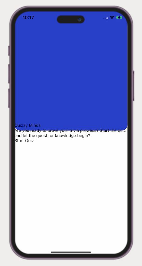
</View>However, if you try running the code as is, you will encounter a screen that is far from our expectations.
Now, let's embark on the journey of making it visually appealing. To achieve this, we need to import StyleSheet from react-native and create the desired styles for our components, as demonstrated in the example below.
import { StyleSheet, Text, View, TouchableOpacity } from 'react-native';

const styles = StyleSheet.create({
    container: {
      height: '100%',
      width: '100%',
      backgroundColor: '#fff',
      alignItems: 'center',
      justifyContent: 'center',
    },
    header: {
        position: 'absolute',
        display: 'flex',
        width: '100%',
        height: '49%',
        backgroundColor: '#283fc8',
        borderRadius: 20,
        top: 0,
        justifyContent: 'center',
    },
})
And set this styles in our view
<View style= {styles.container}> {/* Container */}
<View style = {styles.header}> {/* Header */}
<View>
</View>
</View>
<View>
<Text style={styles.title}>Quizzy Minds</Text>
<Text style={styles.paragraph}>Are you ready to prove your trivia prowess? Start the quiz and let the quest for knowledge begin? </Text>
<TouchableOpacity >
<Text style={Style.bigButtonText}>Star Quiz</Text>
</TouchableOpacity>
</View>
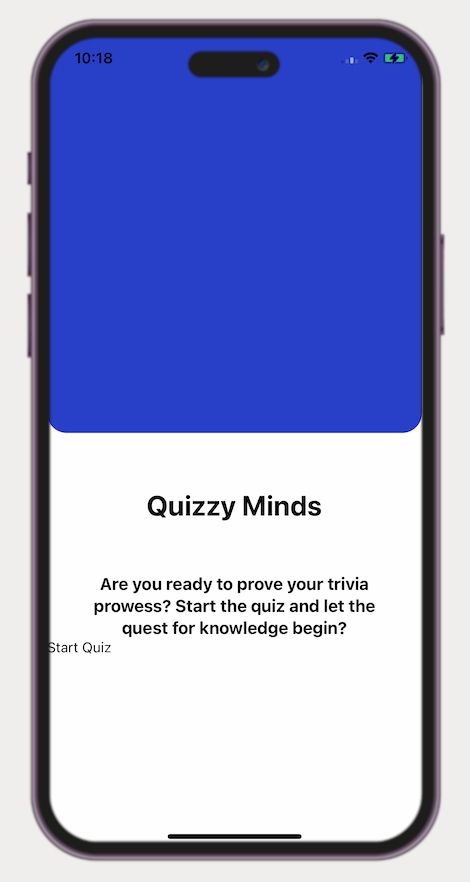
</View>Now, we could differentiate the header from the other sections of the view. However our text appears to be in disarray, but fear not, for we shall rectify it.
Add the next styles to fix our texts
const styles = StyleSheet.create({

	title: {
        marginTop: '15%',
        fontSize: 28,
        fontWeight: 'bold',
        textAlign: 'center',
    },
    paragraph: {
        paddingTop: 50,
        fontSize: 17,
        fontWeight: 'bold',
        textAlign: 'center',
        marginLeft: '10%',
        marginRight: '10%',
        lineHeight: 22,
    },
    contentContainer: {
        position: 'absolute',
        left: 0,
        bottom: 0,
        marginTop: '49%',
        height: '51%',
        width: '100%',
    },
}
And add the styles to our components
<View style={styles.contentContainer}>
    {/* Title */}
    <Text style={styles.title}>
        Quizzy Minds
    </Text>
    {/* Description */}
    <Text style={styles.paragraph}>
        Are you ready to prove your trivia prowess? Start the quiz and let the quest for knowledge begin?
    </Text>

</View>
Is looking better
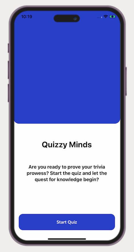
Now, let's elevate the visual appeal of our "Start Quiz" button, making it even more aesthetically pleasing.
To our Stylesheet add
const styles = StyleSheet.create({


    bigButton: {
        position:'absolute',
        backgroundColor: '#283fc8',
        alignSelf: 'center',
        width: '90%',
        height: 57,
        borderRadius: 15,
        justifyContent: 'center',
        bottom: '10%'
    },
    bigButtonText: {
        color: '#fff',
        alignSelf: 'center',
        fontSize: 17,
        fontWeight: 'bold',
    },

}
To our components add the styles
<View style={styles.contentContainer}>

	{/* Button */}
    <TouchableOpacity style={styles.bigButton}>
	    <Text style={styles.bigButtonText}>Start Quiz</Text>
    </TouchableOpacity>
</View>
And you will get this
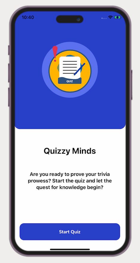
Within our design, we incorporate an engaging animation in the header. To accomplish this, we leverage the power of Lottie. Visit their website and select your preferred animation to download. Follow the steps below to seamlessly integrate it into our project. Let's bring this header to life and captivate our users with captivating animation!
First in your Terminal write the next command to install Lottie in your project
npx expo install lottie-react-nativeOnce the installation is done just add the next lines to your code
import LottieView from 'lottie-react-native'; // on yhe top of your code
import {Dimensions} from 'react-native';

const windowWidth = Dimensions.get('window').width;

export default function HomeView() {
    return (
        <View style= {Style.container}>
    		/* The content */
        </View>
    );
}

//In your styles
const styles = StyleSheet.create({
innerCircle : {
        height: windowWidth * 0.5,
        width: windowWidth * 0.5,
        alignSelf: 'center',
        borderRadius: 9999,
        backgroundColor: Palette.colors.secondary,
    },
    animation: {
        width: '100%',
        height: '100%',
        alignSelf: 'center'
    },
})
And add this in your view
<View style= {Style.container}>

    <View style = {styles.header}>
        <View style = {[styles.innerCircle]}>
            <LottieView
				autoPlay
				style={styles.animation}
				source={require('../assets/animations/homeAnimation.json')}
			/>
        </View>
    </View>

</View>
Congratulations! You now have an animation that enhances the visual appeal of your view, making it more captivating and engaging than ever before.
We're almost there! Our design-to-code for Home View transformation is nearly complete, with just one final touch remaining. It's time to integrate the custom fonts we carefully selected for this project. By incorporating these unique fonts, we'll add a distinctive and personalized touch to our app's visual identity. Let's bring our design vision to life by embracing the power of these custom fonts.
In your terminal write the next command to install all what is need to use custom fonts in react-native
npx expo install expo-splash-screen
npx expo install expo-font
In your App.js make the next modifications
/* Add this import */

import { useFonts } from 'expo-font';
import * as SplashScreen from 'expo-splash-screen';


/* Add this line just before export default function App */
SplashScreen.preventAutoHideAsync();

export default function App() {
    /* this to load the fonts */
	const [fontsLoaded] = useFonts({
        /*Make sure to accurately specify the file paths to the location where you saved the fonts. In our case, we created a dedicated folder named "fonts" inside the "assets" directory, where all our fonts reside.*/
    	'Pelita': require('./assets/fonts/Pelita.otf'),
    	'Pelita-Bold': require('./assets/fonts/Pelita-Bold.otf'),
    });

    /* This mechanism will take care of the font loading process and its implications. */
    const onLayoutRootView = useCallback(async () => {
    	if (fontsLoaded) {
      	await SplashScreen.hideAsync();
    	}
  	}, [fontsLoaded]);

    /* In the absence of loaded fonts, the splash screen will persist within the view, ensuring a smooth and uninterrupted user experience.*/
    if (!fontsLoaded) {
    	return null;
	}

    /* Once the fonts are loaded, our views will seamlessly manifest within our app, showcasing their true visual allure.*/
  return (
    <View style={{ flex: 1 }} onLayout={onLayoutRootView}>
		<HomeView></HomeView>
	</View>
  );
}
And in our styles in the HomeView.js lets add the font family for our texts
const styles = StyleSheet.create({
	/* others styles */
	title: {
		/* other properties */
		fontFamily: 'Pelita-Bold'
	},
	paragraph: {
		/* other properties */
		fontFamily: 'Pelita'
	},
	bigButtonText: {
		/* other properties */
		fontFamily: 'Pelita-Bold'
	},
	/* others styles */
})
And there you have your view
The Questions view
Now, it's time to delve into the creation of the questions view, where the magic truly happens. But before we proceed, let's make some necessary changes to enable seamless navigation between the screens we have. Let's ensure smooth transitions and effortless exploration as we dive into the heart of our trivia experience.
In your Terminal write
npx expo install react-native-screens react-native-safe-area-context
npm install @react-navigation/native
npm install @react-navigation/native-stack
And when the installation is done go to the App.js and make this modifications
/* At the top of the file, include the following imports to ensure all necessary dependencies are available. */
import { NavigationContainer } from '@react-navigation/native'; //
import { createNativeStackNavigator } from '@react-navigation/native-stack';

/* Just before the export default function App(), place the following code snippet to incorporate the desired functionality. */
const Stack = createNativeStackNavigator();

SplashScreen.preventAutoHideAsync();

export default function App() {

    return (
		<NavigationContainer>
			<Stack.Navigator
				initialRouteName='Home'
				screenOptions={{ headerShown: false }}
			>
				<Stack.Screen name='Home' component={HomeView} ></Stack.Screen>
			</Stack.Navigator>
        </NavigationContainer>
	);
Inside the views folder, create a new file named QuestionView.js and structure its contents as follows. Let's shape the QuestionView to fulfill its purpose and captivate users with its engaging interface.
/* Text, View, TouchableOpacity are the components we are going to use to create our view*/
import { Text, View, TouchableOpacity } from 'react-native';

export default function QuestionView() {

	return (
		<View>
        	<Text>Question view</Text>
		</View>
	);
}
Go to App.jsand do this modifications
/* Add this import */
import QuestionsView from './views/QuestionView';

export default function App() {
	/* other content */
    return (
		<View style={{ flex: 1 }} onLayout={onLayoutRootView}>
      		<NavigationContainer >
          		<Stack.Navigator
            		initialRouteName='Home'
            		screenOptions={{ headerShown: false }}
          		>
                    {/* add this line */}
            		<Stack.Screen name='Questions' component={QuestionsView} ></Stack.Screen>
            		<Stack.Screen name='Home' component={HomeView} ></Stack.Screen>

          	</Stack.Navigator>

      	</NavigationContainer>
      </View>
  );
}
Go to HomeView.js and make this modifications
<TouchableOpacity
	style={styles.bigButton}
	/* Add this */
	onPress={
    	() => {navigation.navigate("Questions")}
	}
>
	<Text style={Style.bigButtonText}>Start Quiz</Text>
</TouchableOpacity>
And now with each press of the "Start Quiz" button, your app will seamlessly transition to the Questions view.
Now, let's return to QuestionView.js and breathe life into it. Upon closer inspection of our design, we notice two distinct components: the Progress Component and the Question Component itself. To create a modular and organized structure, let's break down this view into these individual components. By doing so, we can ensure better maintainability and flexibility as we build our interactive trivia experience. For that create a folder named components and inside create 2 files: ProgressComponent.jsand QuestionComponent.js and add those to our QuestionView.js
QuestionComponent.js:
/* Our Question Component */
import { StyleSheet, Text, View, TouchableOpacity } from 'react-native';

export default function QuestionComponent() {

    return (
        <View>
            <Text> Question component </Text>
        </View>
    )

}

const localStyle = StyleSheet.create({

})
ProgressComponent.js:
/* Our Progress Component */
import { StyleSheet, Text, View, TouchableOpacity } from 'react-native';

export default function ProgressComponent(props) {

    return (
        <View>
            <Text> Progress component </Text>
        </View>
    )

}

const localStyle = StyleSheet.create({

})
QuestionView.js:
import { Text, View, TouchableOpacity } from 'react-native';

/* add this imports */
import QuestionComponent from './components/QuestionComponent';
import ProgressComponent from './components/ProgressComponent';

export default function QuestionView() {

	return (
		<View>
			<ProgressComponent></ProgressComponent>
        	<QuestionComponent></QuestionComponent>
        	{ /* Add a close button */	}
			<TouchableOpacity>
                <Text>X</Text>
            </TouchableOpacity>
		</View>
	);
}
Let's start implementing the QuestionComponent in our view we are going to need the question and the options so we could start with something like this
<View>
	<Text>What is the capital of France?</Text>
	{/* Option container*/}
    <View>
        {/* Option 1 */}
        <TouchableOpacity>
            <Text>London</Text>
		</TouchableOpacity>
        {/* Option 2 */}
		<TouchableOpacity>
            <Text>Paris</Text>
		</TouchableOpacity>
        {/* Option 3 */}
        <TouchableOpacity>
            <Text>Rome</Text>
		</TouchableOpacity>
	</View>
	<TouchableOpacity>
        <Text>Next</Text>
    </TouchableOpacity>
</View>
However, by following this approach, we would be hardcoding our questions, which limits the potential of our app. To unlock greater flexibility and scalability, let's take a dynamic approach. To achieve this, we will leverage the power of React Native props, which serve as a means to pass parameters between views and components. By harnessing the capabilities of props, we can create a dynamic and customizable experience that enhances the functionality and versatility of our app.
Simply add props to the component initializer, as demonstrated in the following snippet.
export default function QuestionComponent(props) {
 /* content*/
}
And now in your view
<View>
	<Text>props.question</Text>
	{/* Option container*/}
    <View>
        <TouchableOpacity>
            <Text>props.options[0]</Text>
		</TouchableOpacity>
		<TouchableOpacity>
            <Text>props.options[1]</Text>
		</TouchableOpacity>
        <TouchableOpacity>
            <Text>props.options[2]</Text>
		</TouchableOpacity>
	</View>
	<TouchableOpacity>
        <Text>Next</Text>
    </TouchableOpacity>
</View>
But now we are assuming that all our question will have 3 options that may not be always true so lets make it more dynamic
<View>
	<Text>props.question</Text>
	{/* Option container*/}
    <View>
    {
		props.options.map((item, i) => (
	    	<TouchableOpacity key= {i}>
            	<Text>props.options[i]</Text>
			</TouchableOpacity>
    	)
	}
	</View>
	<TouchableOpacity>
        <Text>Next</Text>
    </TouchableOpacity>
</View>
Now, our component can handle any number of options effortlessly.
Whenever we utilize this component, we can follow this pattern to ensure seamless integration and maximize its potential. Let's embrace this approach to enhance flexibility and scalability throughout our trivia app.
<QuestionComponent
	question = {"What is the capital of france?"}
	options = {["a) London", "b) Paris", "c) Rome"]}
	correctAnswer = "b"
>
</QuestionComponent>
Handling user answers is a breeze! We can leverage the onPress event of each option to capture the user's selection effortlessly. Implementing this functionality is as simple as follows. Let's empower our app to respond to user input with ease and create an immersive and interactive trivia experience.
<TouchableOpacity
	key= {i}
	onPress = {() => {onOptionClick(i)}}
>
	<Text>props.options[i]</Text>
</TouchableOpacity>
And the onOptionClickimplementation is this
export default function QuestionComponent(props) {

    /* add this state */
    const [optionSelected, setOptionSelected] = useState(-1)

	/* onPotionClick implementation */
    const onOptionClick = (selectedOption) => {
		/* This approach enables us to ignore subsequent actions after the user's initial selection. */
        if(optionSelected != -1) return;
        setOptionSelected(selectedOption);
    }

    return (
    	/* View */
    );

}
Wasn't that a piece of cake? So easy and delightful!. Now, let's sprinkle some styles and witness the magnificent transformation of our view.
<View style= {[localStyle.bg]}>
	<Text style={localStyle.questionText}>
		{props.question}
	</Text>

	<View style={localStyle.optionsContainer}>
		{props.options.map((item, i) => (
			<TouchableOpacity
				key={i}
				style={ buttonCurrentStyle(i) }
				ref={el => answers.current[i] = el}
				onPress = {
					() => {onOptionClick(i)}
				}
			>
				<View>
					<Text style={ textCurrentStyle(i) }> {item} </Text>
						<Ionicons
							style = {localStyle.infoIcon}
							name={currentInfoIcon(i)}
							size={25}
							color={currentColorIcon(i)}
						/>
					</View>

			</TouchableOpacity>

		))}
	</View>

	<TouchableOpacity
		style={[localStyle.bigButton, localStyle.nextButton]}
	>
		<Text style={localStyle.bigButtonText}>
			{props.isLastQuestion ? "Finish" : "Next"}
		</Text>
	</TouchableOpacity>
</View>
And the styles
const localStyle = StyleSheet.create({
    bg: {
        position: 'absolute',
        top: '18%',
        height: '82%',
        width: '100%',
        backgroundColor: '#fff',
        borderTopLeftRadius: 25,
        borderTopRightRadius: 25,
    },
    questionText: {
        fontFamily: 'Pelita-Bold',
        fontSize: 20,
        marginLeft: '5%',
        marginTop: 60,
        width: '90%',
        marginRight: '5%',
        textAlign: 'center',
    },
    optionsContainer:{
        top: '5%',
    },
    optionButton: {
        marginTop: 15,
        width: '85%',
        height: 60,
        backgroundColor: '#f7f7f9',
        alignSelf: 'center',
        borderRadius: 10,
    },
    optionButtonText: {
        marginLeft: 17,
        fontFamily: 'Pelita',
        fontSize: 15,
        lineHeight: 60,
        color: '#000',
        display: 'flex',
        flexDirection: 'row',
    },
    nextButton: {
        width: '85%',
        bottom: '18%'
    },

    optionWrongButton: {
        marginTop: 15,
        width: '85%',
        height: 60,
        backgroundColor: '#f55839',
        alignSelf: 'center',
        borderRadius: 10,
    },
    optionRightButton: {
        marginTop: 15,
        width: '85%',
        height: 60,
        backgroundColor: '#2ebe5f',
        alignSelf: 'center',
        borderRadius: 10,
    },
    optionHintButton: {
        marginTop: 15,
        width: '85%',
        height: 60,
        backgroundColor: '#f7f7f9',
        borderColor: '#f55839',
        borderWidth: 1,
        alignSelf: 'center',
        borderRadius: 10,
    },
    optionSelectedText: {
        marginLeft: 17,
        fontFamily: 'Pelita-Bold',
        fontSize: 15,
        lineHeight: 60,
        color: '#fff'
    },
    infoIcon:{
        position: 'absolute',
        right: 20,
        top: 17.5,
    },
    bigButton: {
        position:'absolute',
        backgroundColor: '#283fc8',
        alignSelf: 'center',
        width: '90%',
        height: 57,
        borderRadius: 15,
        justifyContent: 'center'
    },
    bigButtonText: {
        color: '#fff',
        alignSelf: 'center',
        fontSize: 17,
        fontWeight: 'bold',
        fontFamily: 'Pelita-Bold'
    },
})
Now, if we take a closer look at our view, we have introduced innovative ways to set styles using the dynamic state values. Pay attention to the usage of style={textCurrentStyle(i)} and style={buttonCurrentStyle(i)}. These are functions that leverage the power of the optionSelected state, enabling us to dynamically adjust the view based on the user's answer. Their implementation is below:
const getIndexCorrect = () => {
/* Here's a nifty trick to convert letters to integers: consider 'a' as 0, 'b' as 1, and 'c' as 2. By applying this simple mapping, we can effortlessly convert characters to their corresponding numerical values. */
return props.correctAnswer.charCodeAt(0) - 'a'.charCodeAt(0)
}
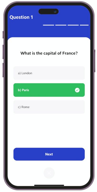
const buttonCurrentStyle = (i) => {
/* When the user has not made a choice */
if(optionSelected == -1) return localStyle.optionButton
let indexCorrect = getIndexCorrect()
/* If the user selects the incorrect option and it happens to be this option */
if (optionSelected == i && i != indexCorrect)
return localStyle.optionWrongButton
/* If the user selects the correct option and it happens to be this option */
else if (optionSelected == i && i == indexCorrect)
return localStyle.optionRightButton
/* In the scenario where the user selects the wrong option and this option happens to be the correct one */
else if (optionSelected != i && i == indexCorrect)
return localStyle.optionHintButton
else return localStyle.optionButton
}
const textCurrentStyle = (i) => {
/* Whenever this option is selected, we modify the color of the text to reflect the user's choice. */
if (optionSelected == i) {
return localStyle.optionSelectedText;
}
else return localStyle.optionButtonText;
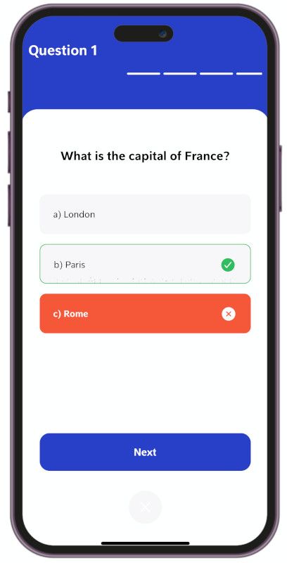
}As you can see in our view, we have incorporated an <Ionicons> element, which is available through Expo. This allows us to leverage the extensive collection of icons available at https://ionic.io/ionicons. We have employed a similar approach to dynamically modify its value based on the user's selection. Let's harness the power of icons and enhance the visual appeal of our trivia app. The implementation to dynamically change their values is this.
const currentInfoIcon = (i) => {
	let indexCorrect = getIndexCorrect()
	if (optionSelected == -1) return ""
	else if (optionSelected == i && i != indexCorrect) return "close-circle"
	else if (i == indexCorrect) return "md-checkmark-circle"
	else return ""
}

const currentColorIcon = (i) => {
	let indexCorrect = getIndexCorrect()
	if (optionSelected != i && i == indexCorrect)
		return Palette.colors.goodAnswer
	else return Palette.colors.whiteText
}
So far you should have this
Finally, it's time to infuse some functionality into our Next button.
<TouchableOpacity
	style={[Style.bigButton, localStyle.nextButton]}
	onPress = {()=> {
    	let indexCorrect = getIndexCorrect();
    	props.onNextClicked(indexCorrect == optionSelected)
    	setOptionSelected(-1);
    }}
>
    <Text style={Style.bigButtonText}>
        {props.isLastQuestion ? "Finish" : "Next"}
    </Text>
</TouchableOpacity>
As you may have noticed, we have introduced two new props: isLastQuestion, which determines whether the button text should be "Next" or "Finish," and onNextClicked, which handles the actions triggered when the button is pressed. These enhancements allow us to tailor the button's behavior and provide a seamless flow through the quiz.
Multiple questions
Up until now, we have been focusing on a single question for our quiz. However, to make it more captivating and engaging, we need to expand our question pool. There are various approaches to achieve this, such as utilizing a REST API, a SQLite database, or even a local file. In our case, we will leverage a local JSON file names questions.json, conveniently located in the assets folder. This file follows a specific format and contains all the questions we will utilize. Feel free to add, modify, or remove questions according to your own app's requirements. Let your creativity flow as you curate an intriguing collection of questions to captivate your users!
{"questions": [
	{
		"id": 1,
		"question": "What is the capital of France?",
		"answer": "b",
		"options": [
			"a) London",
            "b) Paris",
            "c) Rome"
		]
	},
    {
		"id": 2,
		"question": "Who painted the Mona Lisa?",
		"answer": "c",
		"options": [
			"a) Vincent van Gogh",
            "b) Pablo Picasso",
            "c) Leonardo da Vinci"
		]
	},

    {
        "id": 10,
        "question": "What is the largest ocean on Earth?",
        "answer": "c",
        "options": [
            "a) Atlantic Ocean",
            "b) Indian Ocean",
            "c) Pacific Ocean"
        ]
    }
]}
To incorporate these questions into your QuestionView, simply add the following code snippet.
/* content before */
export default function QuestionsView() {
	/* content before */

    /* add this */
    const data = require('../assets/questions.json');
    const [questions, setQuestions] = useState(data.questions);
With our set of questions in place, it's crucial to track the progress of the quiz. Let's dive into the code and incorporate the necessary functionality to achieve this. By doing so, we'll be able to provide users with a clear indication of their progress as they navigate through the quiz. Keep your users informed and motivated every step of the way with this essential addition to our code. Let's make progress tracking an integral part of the trivia experience!
/* content before */
export default function QuestionsView() {
	/* content before */

    /* add this */
    const [currentQuestion, setCurrentQuestion] = useState(0);
And in our view make this change
<QuestionComponent
	question = {questions[currentQuestion].question}
	options = {questions[currentQuestion].options}
	correctAnswer = {questions[currentQuestion].answer}
	isLastQuestion = {currentQuestion == questions.length - 1}
	onNextClicked = {onNextClicked}
	onAbortClicked = {() => clearAnswers()}
></QuestionComponent>
Now, let's implement this change in our view. Do you remember the onNextClickedfunction in our QuestionComponent? Here is where we implement that code
const onNextClicked = (userAnswer) => {
	setQuestions(current => {
		let newValue = [...current];
		newValue[currentQuestion]["userAnswer"] = userAnswer
		return newValue;
    });

    /* By implementing this particular logic, we can gracefully handle the final question, presenting the appropriate actions and displaying the necessary information */
    if (currentQuestion + 1 >= data.questions.length) {

        setCurrentQuestion(0)
    }
	/* For all other cases, we simply increment the progress counter. */
    else setCurrentQuestion(currentQuestion + 1)
}
To dynamically update the information displayed in the QuestionComponent, we need to incorporate the provided code snippet
/* add useEffect */
import { useState, useEffect, useRef } from 'react'

export default function QuestionComponent(props) {

    /* add this */
	useEffect(()=>{
		answers.current = answers.current.slice(0, props.options.length);
    }, [props.options])

}
With the necessary information in hand, it's time to fine-tune our view to accommodate the ProgressComponent. By making these adjustments, we ensure that the progress bar accurately represents the user's progress throughout the quiz. This visual indicator adds a sense of accomplishment and helps users track their journey. Let's implement these changes and create a visually appealing and informative experience for our users. Prepare to witness the transformation as our view seamlessly integrates the ProgressComponent into the overall design of our trivia app!
<View style= {[Style.container, localStyle.bg]}>
    <ProgressComponent
		questions = {questions}
		currentQuestion = {currentQuestion}
	></ProgressComponent>
</View>
Go to ProgressComponent.jsand lets make the changes
<View style={localStyle.bg}>
	<Text style={localStyle.mainText}>
        Question {props.currentQuestion + 1}
    </Text>
    <ScrollView
		ref={scrollRef}
		style = {localStyle.scroll}
		showsHorizontalScrollIndicator={false}
		horizontal= {true}
	>
        <View style={localStyle.scrollBumper}></View>
        {props.questions.map((item, i) => (
        <View
              key={i}
              style={styleByUserAnswer(i)}
              ></View>
        ))}
        <View style={localStyle.scrollBumper}></View>
    </ScrollView>
</View>
Now, let's delve into the key elements of this code snippet and understand their significance. The ScrollView component plays a crucial role by enabling us to maintain a list of questions. Additionally, the color of the user's answer is determined dynamically through the styleByUserAnswer method, ensuring visual differentiation. To render all the questions, we utilize the map function on the props.questions array, mapping each question to its corresponding view.
const styleByUserAnswer = (index) => {

    let userAnswer = props.questions[index]["userAnswer"];

    if (userAnswer == undefined )
        return localStyle.questionBullet
    else if(userAnswer) {
        return localStyle.questionGoodAnswerBullet
    }
    return localStyle.questionWrongAnswerBullet

}
Furthermore, we provide the user with clear feedback regarding the current question through the use of {props.currentQuestion + 1}. This expression dynamically displays the question number, ensuring that users are informed of their progress within the trivia quiz. By incorporating this element, we enhance the user experience by providing them with a sense of context and progression throughout the quiz.
And adding this code we make our progress information to update automatically
/* other content */

export default function ProgressComponent(props) {
	/* add this*/
    const answers = useRef([]);
    const scrollRef = useRef(0);

    useEffect(()=>{
        answers.current = answers.current.slice(0, props.questions.length);
        setTimeout(()=>{
            if (scrollRef.current != null)
                scrollRef.current.scrollTo({x: (props.currentQuestion * 55 + 27.5) })
        }, 200)
    }, [props.questions])

    /* other content */
}
Now you have access to this code, and for the corresponding styles, you can refer to the GitHub repository for further details.
The ScoreView
Now, let's delve into the final view, where we succinctly summarize the user's journey and present the result of their trivia experience. Lets start creating a ScoreView.jsin our views folder like the one below.
/* Text, View, TouchableOpacity are the components we are going to use to create our view*/
import { Text, View, TouchableOpacity } from 'react-native';

export default function ScoreView() {

	return (
		<View>
        	<Text>ScoreView</Text>
		</View>
	);
}
Make the following modifications to the App.js file to implement the final view.
/* add this import */
import ScoreView from './views/ScoreView';

export default function App() {
And
<NavigationContainer >
	<Stack.Navigator
		initialRouteName='Home'
		screenOptions={{ headerShown: false }}
	>
        {/* add this line */}
		<Stack.Screen name='Score' component={ScoreView} ></Stack.Screen>
		<Stack.Screen name='Questions' component={QuestionsView} ></Stack.Screen>
		<Stack.Screen name='Home' component={HomeView} ></Stack.Screen>

	</Stack.Navigator>

</NavigationContainer>
Now go to ScoreView.jsand add this to create our header information with an animation
<View style= {[Style.container, localStyle.bg]}>
	<View style={localStyle.contentContainer}>
        {/* Header begin*/}
		<View style={localStyle.mainInfoContainer}>
			<Text style={localStyle.performanceText}>
				{ achievementMessage()}
			</Text>
			<LottieView
				ref = {lottie}
				autoPlay
				loop={false}
				source={require('../assets/animations/scoreAnimation.json')}
			/>
			<Text style={localStyle.yourScore}>Your Score</Text>
			<Text style={localStyle.yourScoreNumeric}>
                {(100*(scoreValues.correct / (scoreValues.correct + scoreValues.incorrect))).toFixed(2)}%
            </Text>
		</View>
        {/* Header end*/}
    </View>
</View>
This to create the score breakdown add this
<View style= {[Style.container, localStyle.bg]}>
	<View style={localStyle.contentContainer}>
        {/* Header end */ }
		{/* Score info begin*/}
        <View style={localStyle.scoreInfoContainer}>

			<View
				style={[
					localStyle.scoreContainer,
					localStyle.scoreContainerQuestion
                  ]}
			>
				<Text style={localStyle.scoreNumber}>
					{scoreValues.correct + scoreValues.incorrect}
				</Text>
				<Text style={localStyle.scoreText}>
					Questions
				</Text>
			</View>

			<View
				style={[
					localStyle.scoreContainer,
					localStyle.scoreContainerGood
				]}
			>
				<Text style={localStyle.scoreNumber}>
                	{scoreValues.correct}
				</Text>
				<Text style={localStyle.scoreText}>
                	Correct
				</Text>
			</View >

			<View
				style={[
					localStyle.scoreContainer,
					localStyle.scoreContainerWrong
				]}
			>
				<Text style={localStyle.scoreNumber}>
                    {scoreValues.incorrect}
                </Text>
				<Text style={localStyle.scoreText}>
                    Incorrect
                </Text>
			</View>
		</View>
        {/* Score info end*/}
	</View>
</View>
And for the buttons section
<View style= {[Style.container, localStyle.bg]}>
	<View style={localStyle.contentContainer}>
        {/* Header end*/}
		{/* Score info end*/}
		{/* button section begin*/}
		<View style={localStyle.buttonContainer}>
			<TouchableOpacity
				style={[
					localStyle.button,
					localStyle.buttonTryAgain
				]}
				onPress={() => navigation.navigate("Questions")}
			>
				<Text style={localStyle.buttonText}>
					Try Again
				</Text>
			</TouchableOpacity>

			<TouchableOpacity
				style={[
					localStyle.button,
					localStyle.buttonDone
				]}
				onPress={() => navigation.navigate("Home")}
			>
				<Text style={localStyle.buttonText}>
					Done
				</Text>
			</TouchableOpacity>
		</View>
        {/* button section end*/}
	</View>
</View>
Remember to add the imports needed
import { StyleSheet, Text, View, TouchableOpacity } from 'react-native';
import LottieView from 'lottie-react-native';

import { useNavigation } from '@react-navigation/native';
import { useEffect, useRef, useState } from 'react';

export default function ScoreView(props) {

    const navigation = useNavigation();
    const lottie = useRef()
    const [scoreValues, setScoreValues] = useState({
        correct: 0,
        incorrect: 0
    })

    useEffect(() => {
        setScoreValues(props.route.params)
    })

    const achievementMessage = () =>{
        let score = (scoreValues.correct / (scoreValues.correct + scoreValues.incorrect));

        if (score < 0.5) return "Try again"
        else if (score >= 1) return "Perfect"
        else return "Good work!"

    }
    return(/* <View> */)
}
You can find the styles we used in the GitHub repository by following the link provided. As for the functionality, all the required components and logic have been implemented in our app. Your app should resemble something like this.
Branding our app
To create a unique and visually appealing splash screen and app icon for your app, we can utilize the power of AI with DALL·E, a generative model. DALL·E can generate stunning and original images based on given prompts and concepts. By providing specific instructions or ideas, DALL·E can generate custom visual assets that align with your app's branding.
To begin, you can gather inspiration and ideas for the design elements you'd like to incorporate into your splash screen and app icon. Think about the color palette, shapes, symbols, or any specific visual elements that represent your app's identity or concept.
Once you have a clear vision of what you want, you can feed those ideas to DALL·E as prompts. DALL·E will then generate unique images based on those prompts. Iterate the process until you find a splash screen and app icon design that resonates with your vision and effectively represents your app.
Remember to ensure that the generated assets meet the necessary technical requirements for a splash screen and app icon in terms of size, format, and resolution.
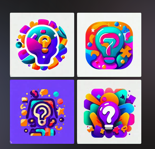
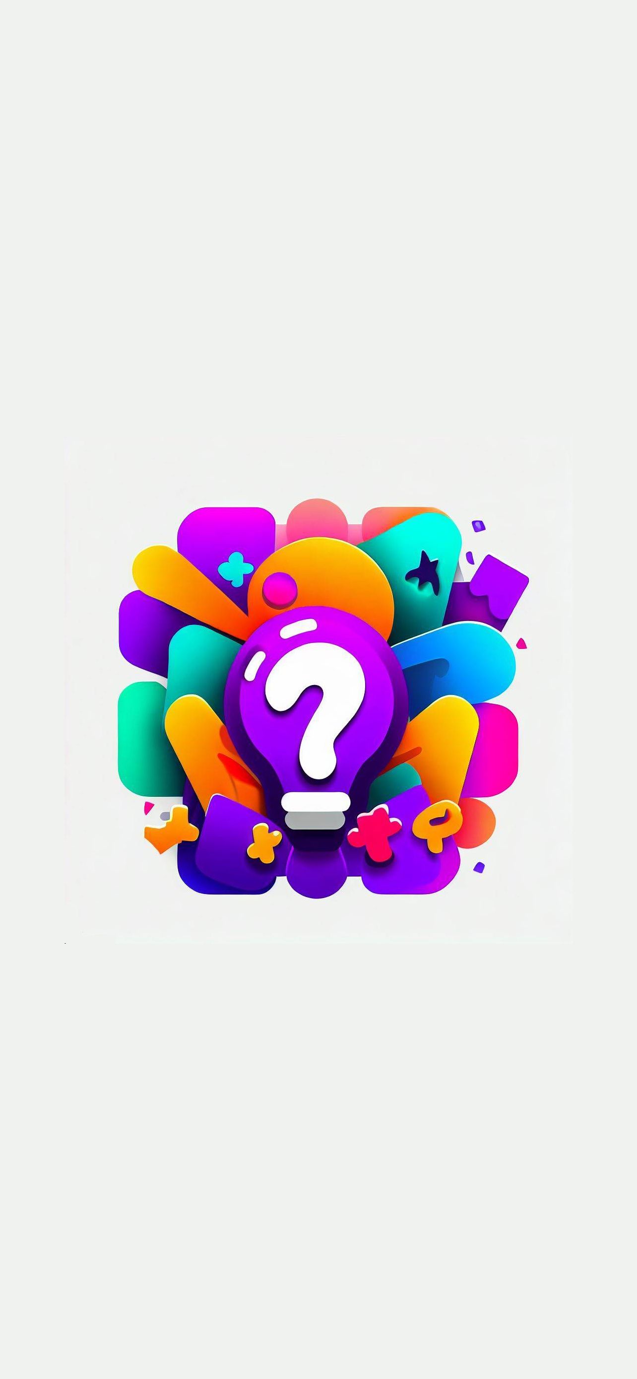
We utilized this prompt to generate a captivating Icon image for our app, incorporating the desired elements and design aesthetics. "Generate a captivating and visually stunning app icon for a trivia app called 'Quizzy Minds.' The design should reflect a sense of excitement, intelligence, and playfulness. Incorporate vibrant colors, dynamic shapes, and elements related to knowledge or quizzes. Consider using puzzle pieces, question marks, or other relevant symbols. The app icon should be recognizable and visually appealing."
These remarkable outputs were generated by DALL·E, showcasing the artistic and creative capabilities of artificial intelligence in crafting captivating visuals.
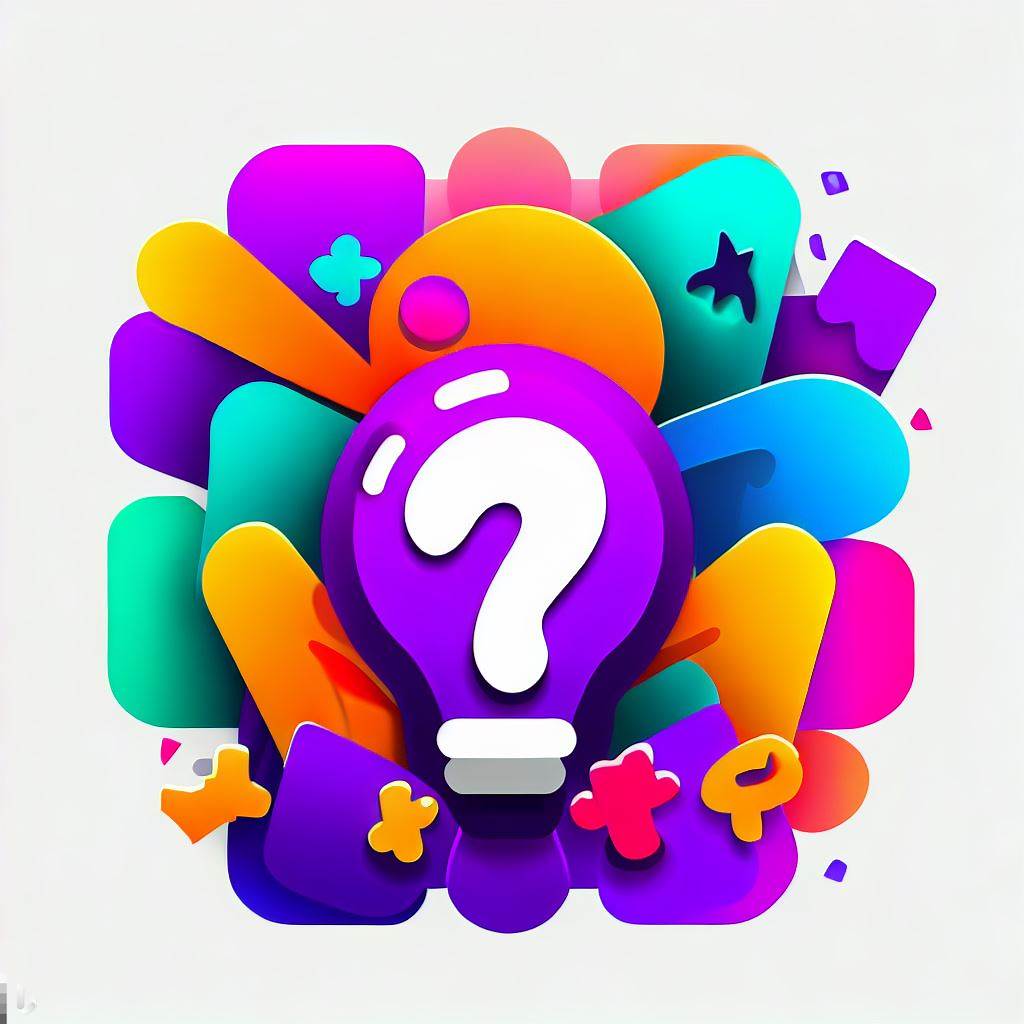
And we selected this
To update the app's branding elements, you can easily replace the files favicon.png, icon.png, and adaptive-icon.png located in the assets folder. Additionally, for the splash screen, we enhanced the image by enlarging it. After replacing the splash.png image in the assets folder, the following image showcases the result.
And thats is
Publishing our app
To publish our app, we need to follow a few steps to ensure it reaches our intended audience. Here's a brief guide on how to publish your app:
- Prepare your app for release by ensuring it meets all the necessary requirements and guidelines.
- Create an account on the desired app store platform, such as Google Play Store or Apple App Store.
- Generate necessary app signing keys and certificates for security and authentication purposes.
- Build a release version of your app, optimizing it for performance and size.
- Upload your app to the app store platform, providing all the required information such as app title, description, screenshots, and icons.
- Set the pricing and distribution options according to your preferences.
- Submit your app for review, where it will undergo a review process by the app store platform to ensure it meets their guidelines.
- Once your app is approved, you can choose the release date and make it available to users.
- Monitor and respond to user feedback and reviews to improve the app and address any issues that may arise.
- Regularly update and maintain your app with new features, bug fixes, and improvements to keep it relevant and engaging.
Remember, the process may vary slightly depending on the app store platform you choose, so be sure to refer to their documentation and guidelines for detailed instructions.
But expo make some steps easier if you have not created an account yet go to https://expo.dev/ and create your account after that do the next steps
Install eas
npm install -g eas-cliRun the next command
eas build --all

#if you want to target an specific platform you could use any of this commands instead
eas build --platform android
eas build --platform ios
When running these commands for the first time, you will be prompted to enter your credentials and choose whether you want Expo to handle the keys for you. If you are new to this process, I would recommend letting Expo handle the keys for a smoother experience.
It also will ask you for the bundle name

And for the iOS app it will ask for the Apple account credentials, after that just wait until the process is over
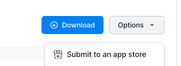
Now, if you navigate to your Expo account and access the build details, you will find the option to submit your app to the Store and make it available to the world.
I hope you enjoyed this tutorial on creating an app from scratch in just a few hours. It's now your time to create amazing apps and perhaps even change the world. Happy coding!